
Updated:
Readtime: 5 min
Every product is carefully selected by our editors and experts. If you buy from a link, we may earn a commission. Learn more. For more information on how we test products, click here.
It’s something that seems obvious but colour coordination is a key consideration when choosing any outfit. From matching your belt and shoes to finding the right shade of blue to complement your new jacket, colour coordination can lead to disastrous results if not handled properly.
Like buying clothes that fit, correctly colour coordinating outfits will vary based on the individual, depending as it does on skin tone, eye and hair colour, as well as general style.
But there are some pretty simple things we can do to up our game, which is why we’ve enlisted the help of some of the most stylish Australian men on Instagram to answer: How do you colour-coordinate an outfit?
You’ll also like:
Style Guide: How to Dress Like Ryan Reynolds
100 Ways to be a Gentleman
26 Most Stylish Australian Men of Instagram
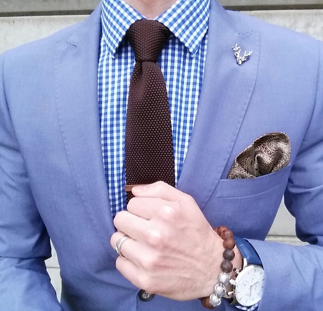
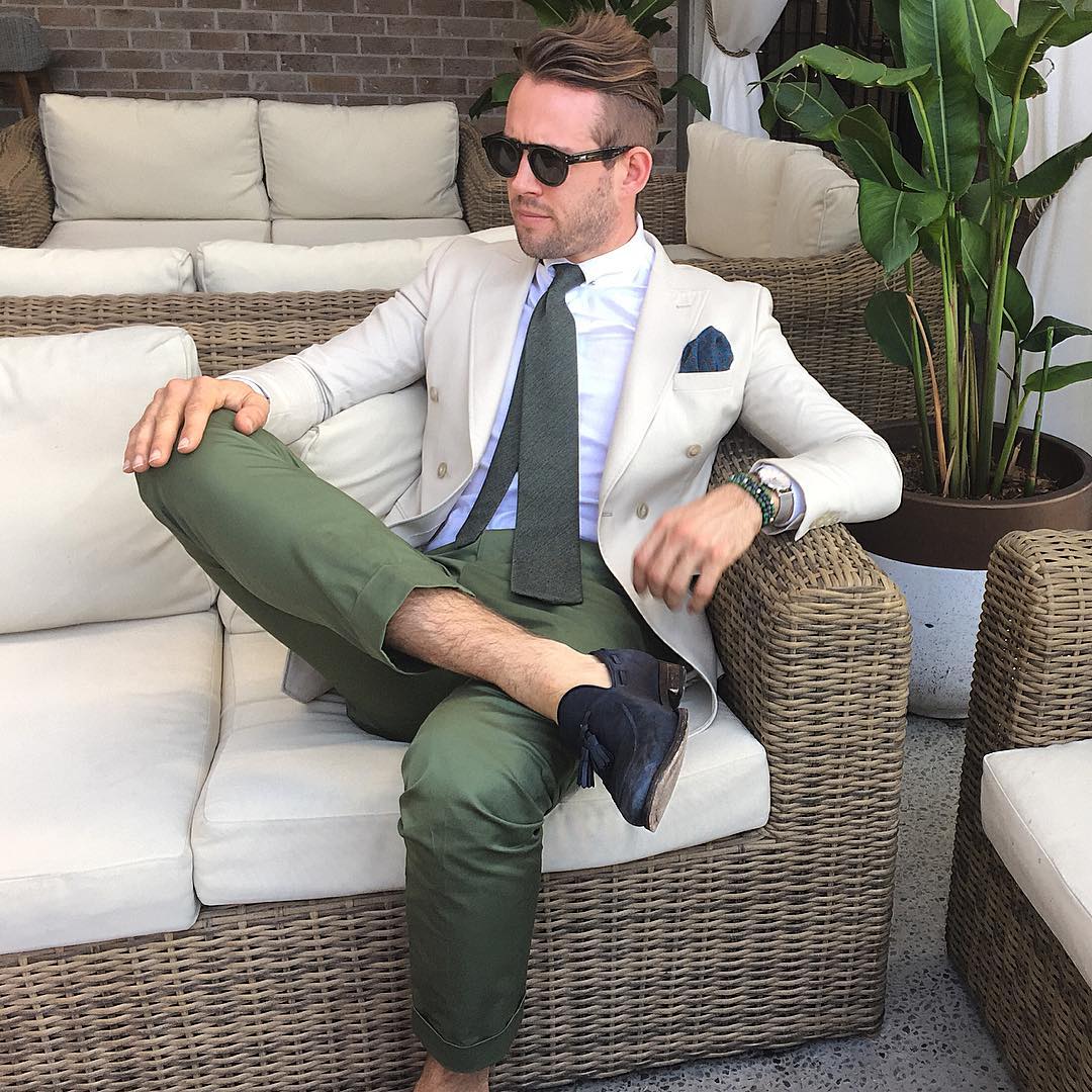
“For me, the key is to choose two dominant colours and have one other as a feature. So if I choose a suit with blue or pinstripe then a check, patterned or plain coloured shirt and thirdly compliment this with a different coloured tie and square.
Having said that there are so many colour options that can work outside of the previous comments if you wear it well and with confidence.”
1. Steve Tilbrook – Founder
Instagram handle: @stevetillystyle
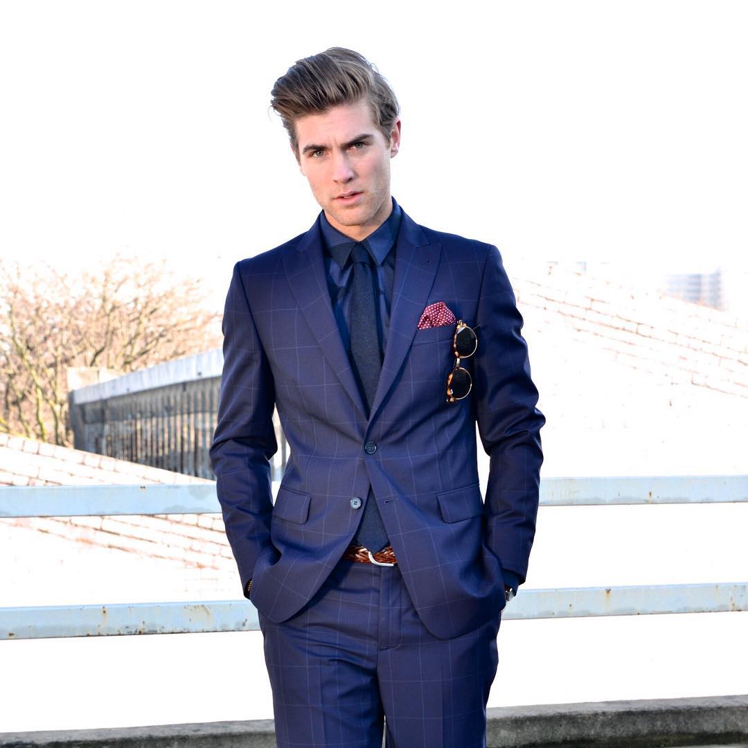
“I usually refer to a variant of Isaac Newton’s colour wheel for assistance when I’m trying to colour block things I haven’t done before. It shows the relationships between all the colours in the visible spectrum and is super handy for anyone who is interested in figuring out the relationships between colours.”
2. Sam Wines – Model and Blogger at Man of Style
Instagram handle: @samwines_
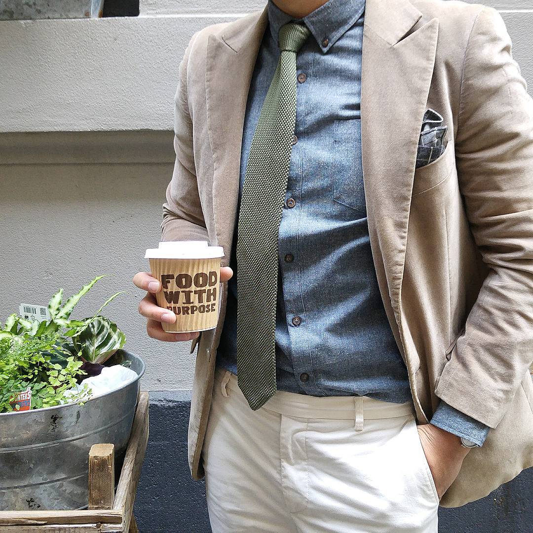
“Understand the basics of colour matching; begin by studying the colour wheel, then apply the understanding to put together an outfit, keep it simple with textures and patterns for now and just focus on colours. Some common colours matches are navy & tan, and green & brown. Also experiment with tonal changes in colour, for example, try pairing a deeper navy jacket with a pair of slightly lighter navy chinos to accentuate your upper body.
Also, remember to match colours to your individual skin complexion. The same outfit worn by two individual people of different skin complexions can vary greatly.
Lastly your tie and pocket square should never be the same colour & pattern.”
3. Lex Mak – Creative Director of Mr Gumbatron
Followers to date: 38.7k followers
Posts to date: 2,081 posts
Instagram handle: @mrgumbatron
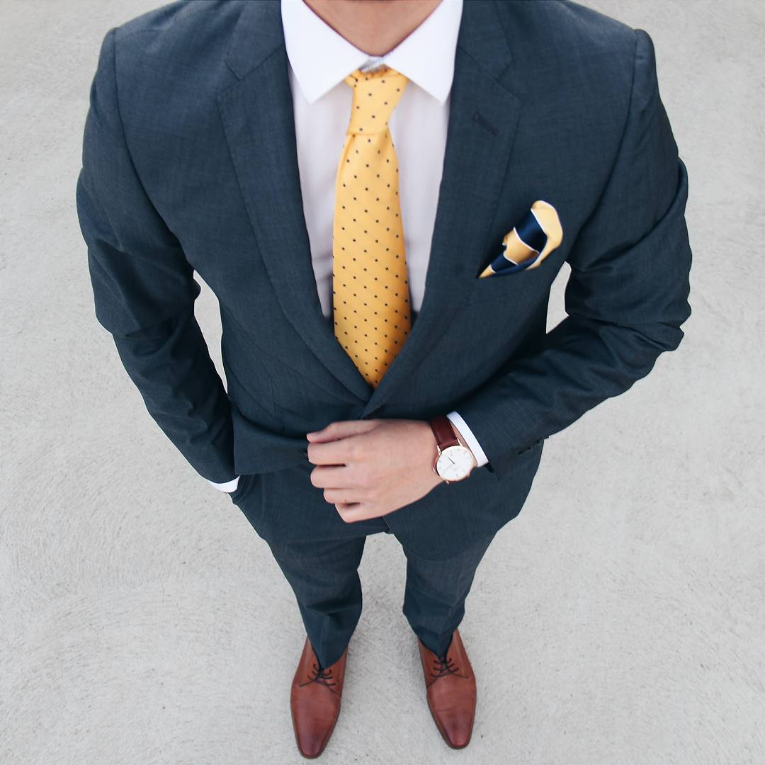
“Navy is one of my favourite colours. As I work in the corporate sector – I need to be in a suit. The main two colours I opt are navy and grey. I think black suits should only be worn during a funeral or cocktail/tuxedo party (but that’s just me). Any colour tie and pocket square compliment a navy/grey suit.”
4. Brian Liu – Founder and Creative Director of The Filtered Fit
Followers to date: 66.9k followers
Posts to date: 505 posts
Instagram handle: @thefilteredfit
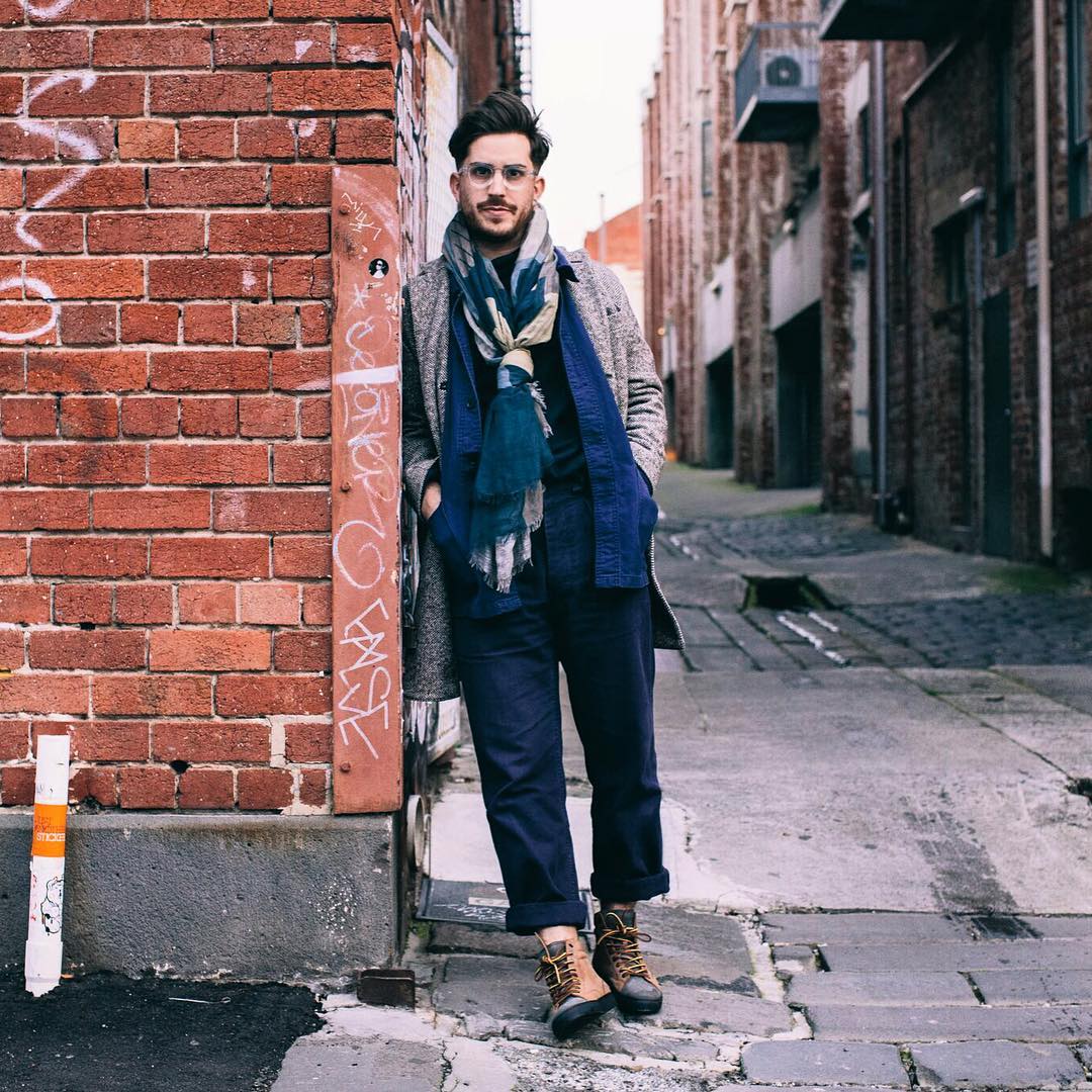
“I often keep tones of colours together. Blues, Browns. If I wear white, I wear it with light colours. Simple really. Keep it Panton-ed.”
5. Christian Kimber – The Best Menswear Designer in the World
Website: christiankimber.com
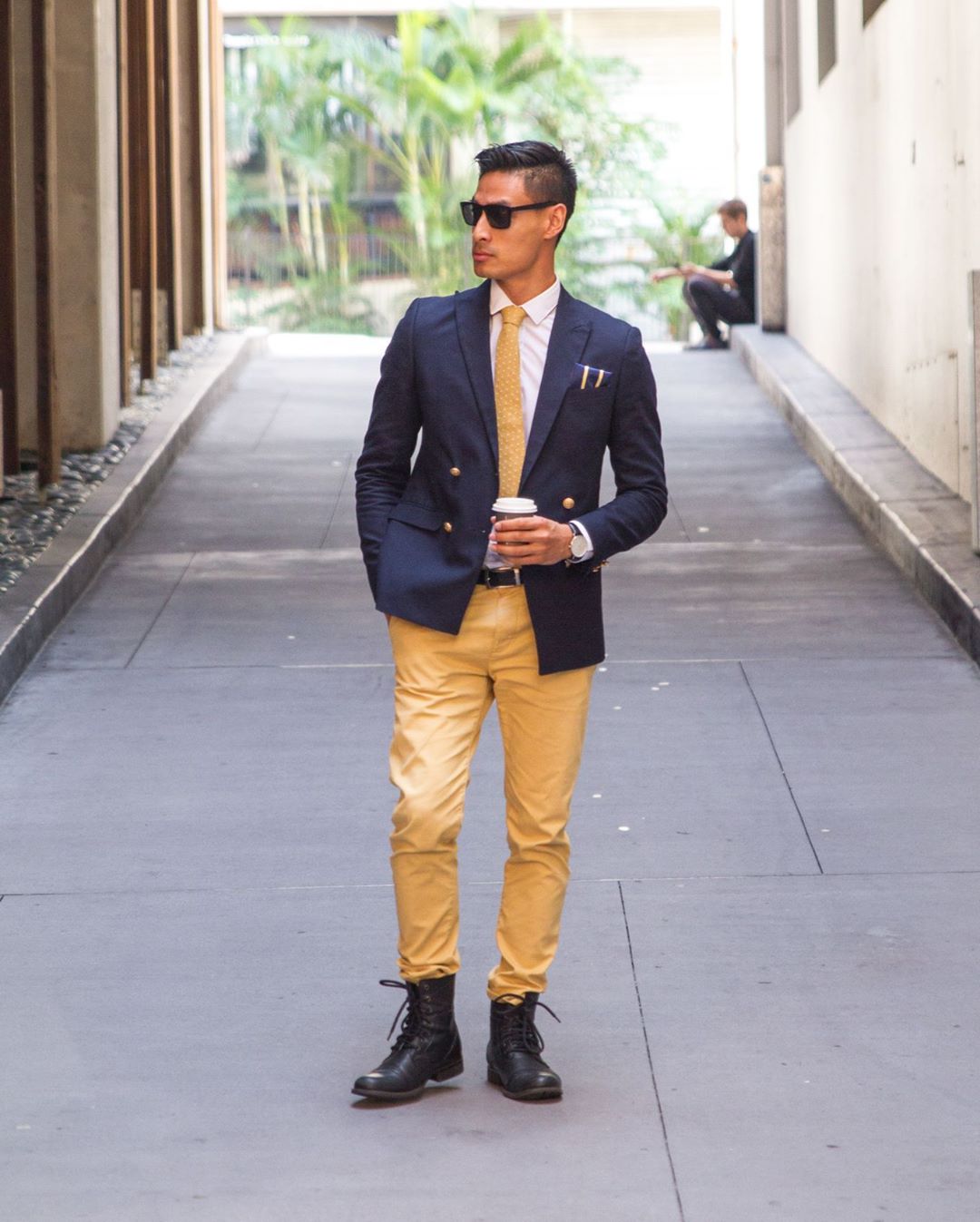
“For me, every outfit has a statement piece which I base my look around. The statement piece can be any form of an item from a tie, to a shirt or watch. From the colours of the statement piece, I choose a suit to match. I tend to colour coordinate my belt, shoes and watch in the same colours but sometimes mix it up depending on the colour of the outfit.”
6. Larry Lim – The Simple Gentleman
Followers to date: 43.1k followers
Posts to date: 1,612 posts
Instagram handle: @larrylim_
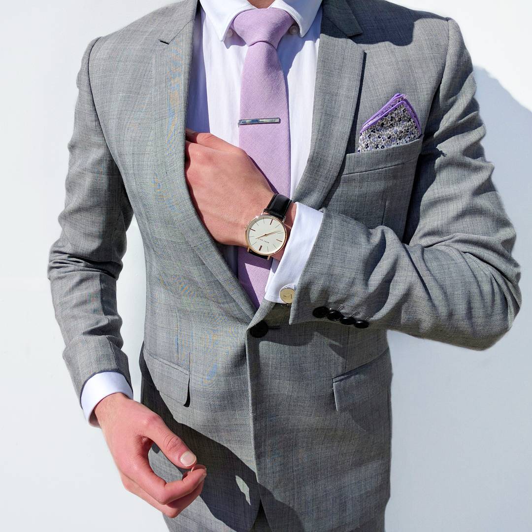
“Contrast your colours and opposites usually work best. Colour coordination is the main thing of nailing a gentleman’s fashion look, yet many have trouble. Know your colour palette and work with colours that suit your skin and hair colour. If you feel comfortable in what your wearing and you’ll already know they match. A rule of thumb is your tie and pocket square always need to match.”
7. Josh Azzi – The Distinguished Gentleman
Followers to date: 17.8k followers
Posts to date: 468 posts
Instagram handle: @thedistinguishedgentleman_
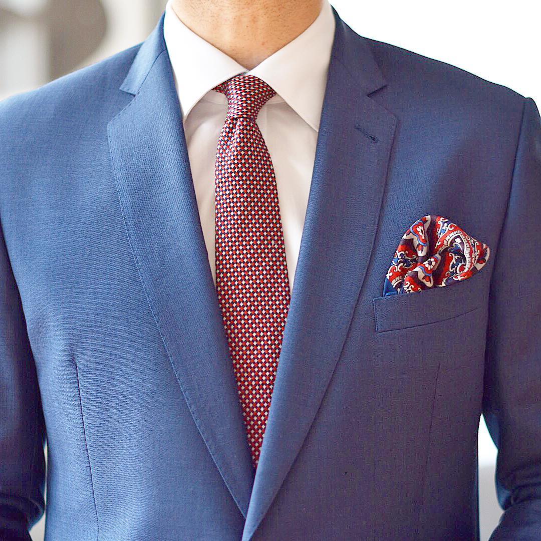
“When wearing a suit, I’ll choose a shirt colour that contrasts well with that suit – such as a white or a pastel colour. A pocket square can add some good colour tones to match the shirt or parts of the tie (in some cases). The shoes and belt should be consistent and the tie should add sharpness to the look. A pair of printed socks can add a fun touch as well.”
8. Paul Juchima – No Paparazzi Man
Instagram handle: @nopaparazziman
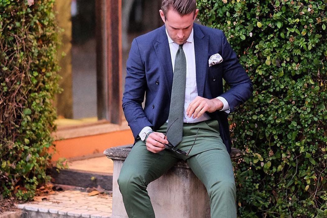
I have a few staples I go with, and one major one is the navy blue suit. Everyone needs one and it is always talked about. Once you have your base suit and garnish it with a pocket square and tie, I get the accessories to match22 or at least both have a touch of colour that matches the suits tones and fabrics.”
9. Shaun Birley – Fashion Importer | Exporter and Influencer
Followers to date: 106k followers
Posts to date: 1,815 posts
Instagram handle: @shaunbirley
You’ll also like:
Style Guide: How to Dress Like Ryan Reynolds
100 Ways to be a Gentleman
26 Most Stylish Australian Men of Instagram












Comments
We love hearing from you. or to leave a comment.