

Updated:
Readtime: 13 min
Every product is carefully selected by our editors and experts. If you buy from a link, we may earn a commission. Learn more. For more information on how we test products, click here.
Ever wondered why certain clothes leave you looking washed out and fatigued, while others instantly give your complexion a healthy, refreshed glow? When building a wardrobe, we tend to fixate on the big variables: the brand, the fit, and the overall aesthetic. But the most overlooked element of a sharp outfit is colour theory. It’s not just about whether that T-shirt matches those jeans, but how the garments interact with your specific skin tone and natural undertones to lock in your personal style profile.
Get it wrong, and you’ll turn up to your next meeting looking like you pulled an all-nighter. Get it right, you’ll look like a man with an impeccable grooming routine who routinely conquers a 6am run. Colour analysis is the precise intersection of art and science, determining exactly how different pigments interact with human complexions.
“Often you find that a colour might look great on your friend, on your partner, on the model, but then when you wear it, it just looks a bit off,” says colour analyst Lisa Doan from Colour Corner in Sydney. “Everyone’s skin tone and features are going to be quite unique, and that’s where colour analysis is very much personalised and tailored to the individual.”
.
It’s especially useful for anyone who feels a bit lost the minute they step inside a department store, because it doesn’t just provide a distinct palette to work from – it gives you clear stylistic guardrails. Mixing and matching becomes second nature once you know exactly which colours will and won’t work for you. This T-shirt with those jeans? It’s much easier to decide once you know exactly which colours will and won’t work for you.
And I’m speaking from personal experience. My husband recently sat down for a colour analysis and has used it to completely transform his wardrobe. Over the last few months, he’s donated bags and bags of clothes (all of which were just taking up space in our wardrobe) to charity.
A few months later, he has a whole new capsule wardrobe, full of versatile items that can be dressed up or down depending on the occasion. No more decision fatigue, no more “does this work with these shoes?” Just simplicity, every time.
What Is Men’s Colour Analysis For Men?
Personal Colour Analysis started with artist Johannes Itten in the early 1900s, before Carole Jackson’s book, Color Me Beautiful (1980) popularised sorting people into the four seasons based on their features.
“A lot of people have seen it on social media, so they think it’s just a recent trend,” says Lisa from Colour Corner. “But it was really popular in the ’80s and ’90s. Artists and designers have always known that colour is relative. Colours next to each other affect how you perceive them.”
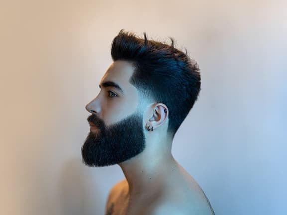
Inspired by my husband’s new wardrobe, I invited Lisa from Colour Corner into the Man of Many office to perform an analysis on myself and two of our team members, each with totally different complexions.
Along with myself, my colleague Rob (the original Rob), and Frank (the boss), would sit with Lisa for around 30 minutes each. She brought a streamlined setup: a professional mirror with built-in daylight lighting and a comprehensive stack of fabric swatches, which would be contrasted against our skin tones one at a time, assessing which colours worked for us.
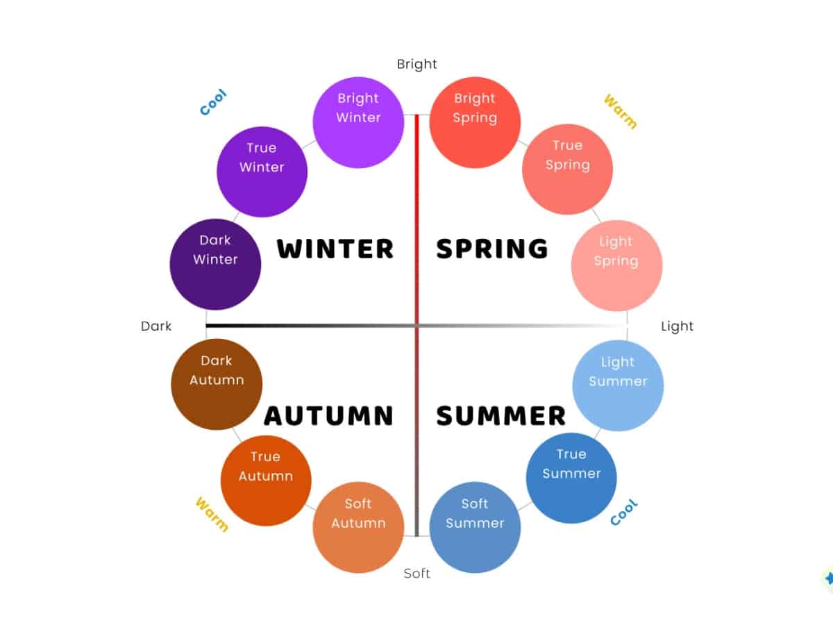
Understanding the 4 Seasons of Colour Analysis
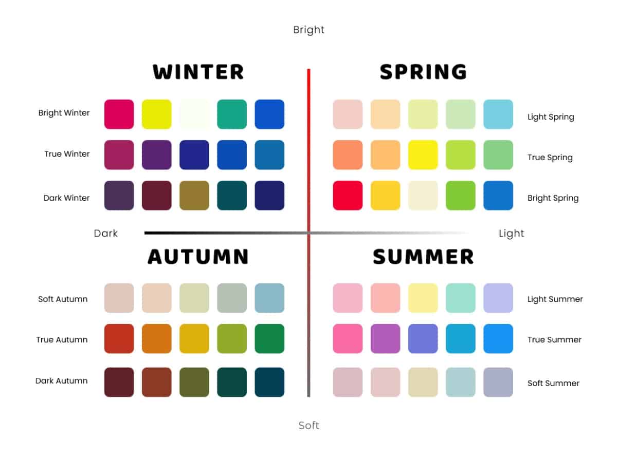
The Four Seasons of Colour Analysis at a Glance
| Season | Base Temperature (Hue) | Saturation (Intensity) | Value (Depth) | Go-To Contrast / Palette |
| Spring | Warm (Yellow base) | Bright / High | Light to Medium | Fresh, clear, and high-luminosity tones (e.g., coral, fresh green) |
| Summer | Cool (Blue base) | Muted / Low | Light to Medium | Soft, relaxed, and smoky mid-tones (e.g., slate grey, denim) |
| Autumn | Warm (Yellow base) | Muted / Low | Medium to Dark | Rich, deeply grounded, and earthy tones (e.g., terracotta, olive) |
| Winter | Cool (Blue base) | Bright / High | Medium to Dark | Bold, crisp, and high-contrast jewel tones (e.g., cobalt, true black & white) |
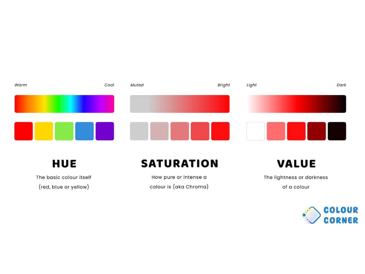
The Basics: Hue, Saturation and Value
When assessing someone’s colour palette, Lisa is looking for three main properties:
- Hue/Temperature: The warm or cool direction of a colour. Warm colours are defined by a yellow base, whereas cool colours have a blue base.
- Saturation: How intense or bold a colour is vs how soft or muted it is.
- Value: How light or dark a colour is on a scale, with stark white and solid black representing the absolute extremes of the spectrum.
There are four distinct palettes within colour analysis – defined by the four seasons – and within each season are three sub-seasons – ‘True’, plus the two crossovers with the seasons on either side.
“The main goal is so that your face is the star of the show. When someone looks at you, the goal is for them to meet your eyes, meet your face, and then everything else follows after,” says Lisa. The Four seasons are defined as:
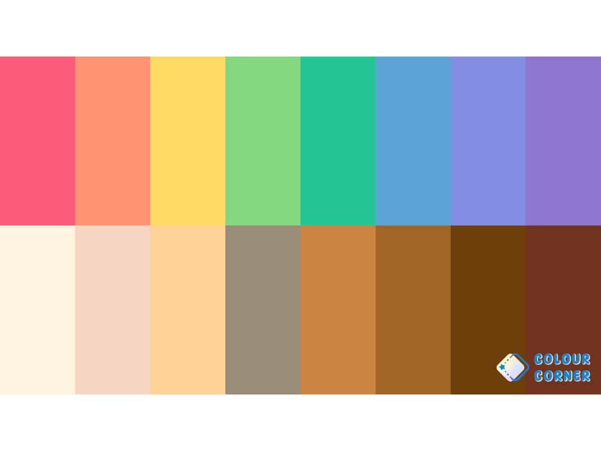
Spring (Warm and Bright)
Spring types are defined by a warm, yellow base and are overall quite bright and fresh.
- Light Spring (Summer border): This sub-season keeps Spring’s signature warm, yellow-toned undertone but flows towards Summer, meaning it prioritises a lighter “value scale”. The colours are airy, fresh, and clear rather than heavy.
- True Spring: The absolute centre of the Spring palette. Warmth is the dominant property here – there is zero coolness borrowed from Winter or Summer. It features bright, high-saturation, yellow-infused colours like vibrant corals and sunny salmons.
- Bright Spring (Winter Border): This type features Spring’s warm base but dials the “saturation” – the intensity of the colour – up to the absolute max. It borrows a bit of Winter’s crisp punch, resulting in loud, high-contrast, high-energy colours.
Summer (Cool and Muted)
Summer types are defined by a cool, blue base and are overall quite light and on the softer, lower-saturation side.
- Light Summer (Spring border): This sub-season is cool-toned but touches the light end of the Spring family. It features delicate, cool, blue-based pastels that are highly luminous and soft without ever becoming heavy or dark.
- True Summer: The purest expression of Summer. It is completely cool-toned with absolutely zero yellow warmth. It is defined by relaxed, gentle mid-tones with low saturation, like slate greys, cool denims, and dusty, blue-based roses.
- Soft Summer (Autumn Border): This type is cool-toned but flows directly into Autumn, heavily prioritising “low saturation”. It is a highly muted, smoky palette where the cool blue-based colours absorb a bit of Autumn’s earthy, texturised quality.
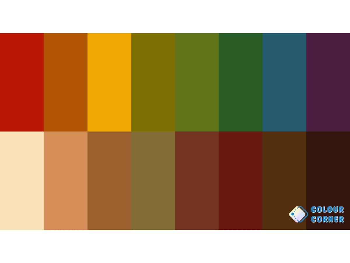
Autumn (Warm and Muted)
Autumn types are defined by a warm yellow base and are characterised by earthy, muted, and low-saturation tones.
- Soft Autumn (Summer border): This type sits right next to Summer. It leans heavily into a lower saturation, meaning the colours are quite dusty and soft. Think of gentle, muted earthy tones like khaki, olive, and warm sand.
- True Autumn: The absolute centre of the Autumn spectrum, where golden warmth is the completely dominant trait. It features rich, deeply grounded, yellow-based tones with a bit more substance, like terracotta, mustard, and burnt orange.
- Dark / Deep Autumn (Winter border): As Lisa noted, ‘deep’ and ‘dark’ describe the same sub-season, which sits between True Autumn and Dark Winter. It retains Autumn’s warm base but borrows Winter’s extreme depth, darkness, and high-contrast punch. It excels in deep forest greens, burgundy, and rich chocolate browns.
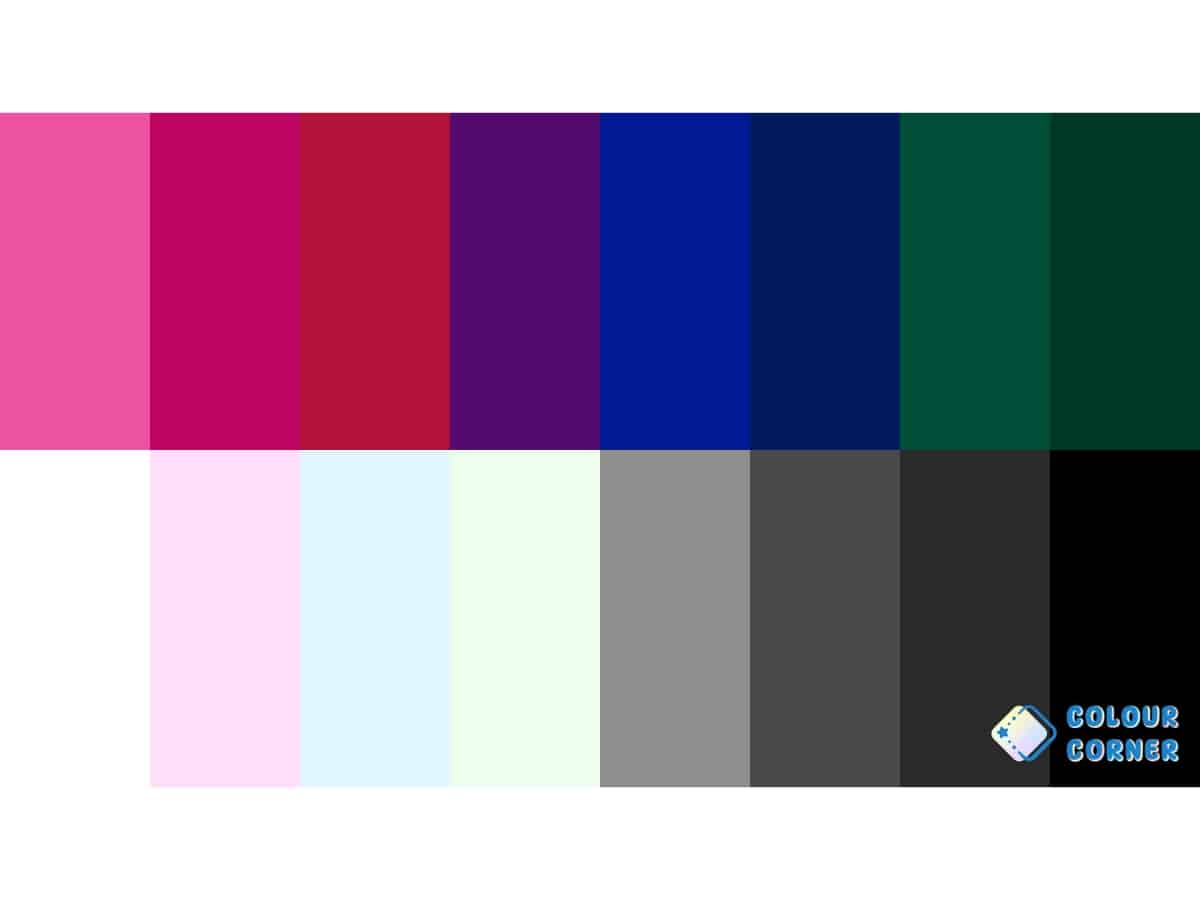
Winter (Cool and Bright)
Winter types are defined by a cool, blue base and feature colours that are incredibly bold, crisp, and high in saturation.
- Bright Winter (Spring border): This sub-season flows directly into Spring. It keeps Winter’s cool, crisp, blue base but gets injected with Spring’s high-saturation luminosity. The colours are dazzling, vivid jewel tones like electric fuchsia and primary cobalt blue.
- True Winter: Pure, icy, unadulterated coolness with zero warmth. It is defined by the starkest, highest-contrast values, and as Lisa points out, it is the only palette where you find true, solid black and stark white.
- Dark / Deep Winter (Autumn border): Touching the Autumn family, this is the darkest sub-season on the value scale. It maintains Winter’s primary cool, blue base but borrows Autumn’s heavy, shadowed depth. This is the home of intense midnights, dark charcoal, and deep navy.
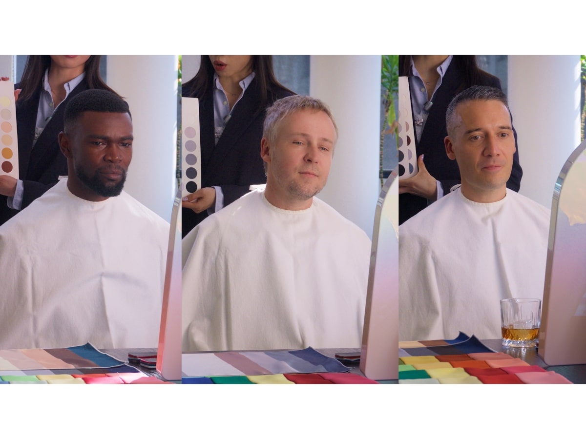
The Results: What We Learned About Our Own Colour Palettes
During roughly 30 minutes of analysis each, Lisa placed fabric swatches on a white base, right under our chins, rapidly switching between warm and cool shades so we could watch our jawlines and skin clarity shift in real-time. The contrast was stark. Where cool blacks and whites left my complexion looking grey and fatigued, earthy tones instantly restored warmth and health to my skin.
Unsurprisingly for three men with such different complexions, each of us has a totally distinct colour palette. Lisa from Colour Corner describes them as:
Rob S: True Autumn
Warm, rich and earthy. Best colours have a yellow/golden base, medium to low saturation and tend to be deeper (lower value) rather than light (higher value). Cool tones tend to dull your skin and bring out purple under the eyes while Autumn colours add warmth and harmony. Your palette includes warm browns, olive, rust, mustard, camel, terracotta and forest green.
Frank: True Winter
Cool, sharp and crisp. Best colours are blue-based, clear and high contrast with medium to high saturation. Warm tones add unnecessary warmth while cool tones define the features and make the eyes pop. Jewel tones are your go-to’s, especially when paired with strong light/dark contrast. Think black, white, navy, magenta, emerald, cobalt, ruby, fuchsia and icy tones.
Rob E: Light Spring
Light, fresh and warm. Best colours are yellow-based like Autumn but much lighter, clearer and brighter. Cool tones can dull the skin, bring out purple under the eyes and emphasise redness while Light Spring colours keep the complexion fresh and bright. Think peach, coral, light aqua, warm pink, fresh green, butter yellow and light camel.
How To Shop For Your Colour Palette
As mentioned earlier, if you ever feel intimidated when shopping online or walking into a department store, a colour analysis is a great way to give yourself some simple guardrails to stay within.
“Once your wardrobe is more within this palette, mixing and matching just becomes effortless,” says Lisa. “It’s not necessarily just about dressing more bold or more loud, it’s about building a wardrobe that’s cohesive, that can mix and match so that there’s no disconnected pieces that you only wear once a year before it ends up in the back of the closet.”
When it comes to shopping for your colour palette, Lisa offers three pieces of advice:
- Curate with intent: “If you are not actively going out of your way to hunt for these colours, often you just miss it. They sit on the shelf, and you walk straight past.”
- Always try things on: “You’ve gotta see it on yourself. A common mistake is trying to figure it out on yourself, but then not comparing it against your face. I have seen quite a few people look at gold and silver jewellery on their wrist, for example. It could look great on the wrist, but what’s most important is how it looks when it’s closer to your face.”
- Don’t chase trends: “With social media, especially TikTok and Instagram, it’s easy to get caught up in trends, impulse shopping and buying pieces that you feel like you ‘should’ own, but one piece won’t suit everyone.”
How Can I Find My Colour Palette?
There’s no shortage of self-described beauty experts on TikTok and DIY tests online, but if you really want to make an investment in yourself, you’ll get plenty of value-for-money from an in-person colour analysis (hot tip: A couple’s session is cheaper per person, and it’s a great idea for a fun date).
At Colour Corner, Lisa offers an express service at $180 for one hour, where you’ll get a no-nonsense analysis that will cover all the basics, and is perfect for anyone who doesn’t wear makeup. A more detailed full service costs $240 for 90 minutes, but will come with advice on hair, jewellery and makeup. For couples, Lisa offers a $410 package that includes one Express Analysis and one standard Colour Analysis.
Colour Corner Details
- Address: Suite 409, Level 4, 478 George Street, Sydney, NSW 2000 (Opposite QVB)
Opening Hours
- Mon, Wed, Fri: 11:00 am – 7:00 pm
- Thu: 11:00 am – 9:00 pm
- Sat – Sun: 12:00 pm – 7:00 pm
- Tue: Closed
Contact & Bookings
- Email: [email protected]
- Instagram: colourcorner_syd
Common Questions About Colour Analysis For Men
No, says Lisa Doan from Colour Corner. “What really determines your season is your undertone. Undertone stays the same forever. But grey hair will soften your overall look, which means you may want to lean towards the softer colours within your existing palette.”
Absolutely. You don’t need perfect colour vision to see the benefits of an analysis. The process isn’t about identifying the pigments on the fabric; it’s about observing how those wavelengths affect your facial features. As Lisa notes, “even with colour blindness, you should still be able to see some changes in your skin.” During a session, you will easily spot how the wrong shade brings out shadows or greyness around your eyes and jawline, while the right shade instantly clears up your complexion.
Not necessarily, but you will learn to style them better. True solid black and stark white are the most extreme values on the lighting scale, and they are actually incredibly harsh on most men. Unless you are a True Winter, black can often look like it is “wearing you” rather than the other way around. Instead of tossing your wardrobe, colour analysis teaches you how to transition to smoother alternatives, like swapping stark white for warm creams or beiges, and replacing heavy black blazers with rich navies or deep chocolate browns for a more cohesive, elevated look.


Comments
We love hearing from you. or to leave a comment.